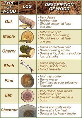
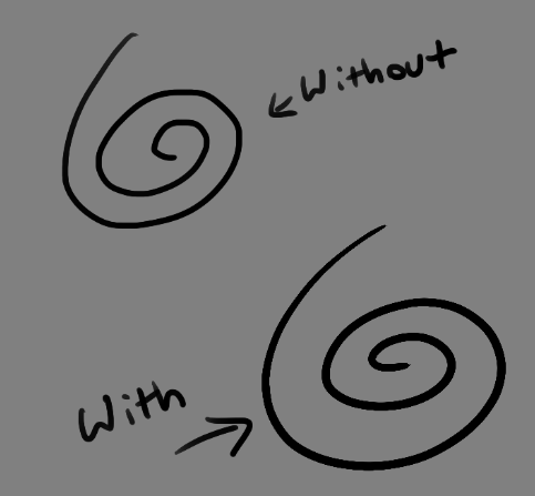
The dos and don’ts of designing for accessibility are general guidelines, best design practices for making services accessible in government. Currently, there are six different posters in the series that cater to users from these areas: low vision, D/deaf and hard of hearing, dyslexia, motor disabilities, users on the autistic spectrum and users of screen readers.
[…] Another aim of the posters is that they’re meant to be general guidance as opposed to being overly prescriptive. Using bright contrast was advised for some (such as those with low vision) although some users on the autistic spectrum would prefer differently. Where advice seems contradictory, it’s always worth testing your designs with users to find the right balance, making compromises that best suit the users’ needs.
I’ve been asked many times what someone should look for when trying to find a good artist. The best way you can do this is to look at their portfolio, whether it’s in a book at their shop or online. If they don’t have good work in their portfolio, they’re probably not good artists.
The shop may be clean, the people there might be nice, and the design they draw up for you might be exactly what you want, but if your artist doesn’t stand up to the points listed above, then you’re going to get a bad tattoo.
It’s okay to walk into a shop, talk with an artist for a while, and decide you don’t want a tattoo from them. Even if the artist has a bad attitude about it or tries to convince you to just let them do it, remember this is going to be on your body for the rest of your life.
Guys I just found the most amazing fucking website mswishlist.com where agents basically say what kind of books they’re looking for and you can search agents by what genres they look at and omg I hope this site is still a thing when I have a finished manuscript!!!
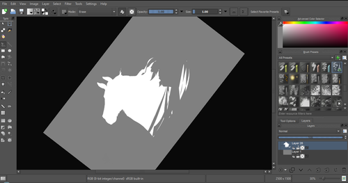
Krita is a painting program that has been around for a while, and in the last few years, underwent major changes and improvements. Because of these improvements, many artists are using it not just because it is free, but because it offers amazing features. These are by no means all of the great things Krita has to offer, but simply some of my favorite features of the program.
1. The Brush Engines.
Yes, engines. As in plural. There are many. And they all do different things. There is no way you could possibly capture all of its possibilities with one screen shot, but here are just some of the possibilities. Along side standard round, square, and shape, and textured brushes, there are brushes that smear, blend, and create interesting abstract strokes. There are brushes for filters, and one of my favorites, the Experiment Brush, which is basically a pre-filled lasso tool.
Brushes also support weighted smoothing, or brush stabilizers.
This is incredibly useful for line art. And while I do not usually use this feature, it is something that I feel many programs are lacking, such as Photoshop.
But its brushes aren’t the only thing about Krita with variety.
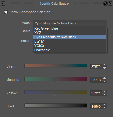
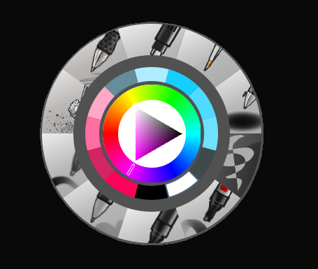
2. Color Selector Customization.
Whether you prefer something basic, or something more complicated, Krita will likely have what youre looking for. You are not likely to find yourself missing your other program’s color wheels. There are even more options than this, and other color selectors.
Gotta love that customization.
Krita also has some great naviation tools.
3. On the fly rotation, zoom, and brush sizing.
With krita, zooming, rotating, and brush size scaling are all smooth, and dynamic with the use of hot keys. These are features I miss when in other programs. To zoom, Ctrl+Middle mouse button, hover over the screen to zoom in and out. The same with shift rotates (press the ‘5’ key to reset rotation). Holding down shift and draging your brush on the canvas dynamically changes its size, allowing you to see the change, and get the exact size you want without brackets. Brackets also work, if that’s what you are used to. Krita also has highly customizable hot keys.
4. The Pop Up Pallet
The pop up pallet is a set of your 10 favorite brushes (which you can edit), and a built in color wheel that appears when you right click on the canvas. It is incredibly useful for switching between those few brushes that you use in almost every picture.
5. Real time, seamless tiles creation.
Pressing the W key in Krita will infinitely tile your canvas, and allow you to work real time on simple to complex tiled images. You can zoom in and out to see how your tiles work form a distance, and paint freely to create seamless artwork easily, without having to check using filters and manually tiling. Very usefull for patterns, backgrounds, and games.
6. The Symmetry Tool
This one goes without saying, Krita supports both horizontal and vertical symmetry, along with a brush that is capable of radial symmtry with as many directions as you like.
Go nuts, kid.
There are many more reasons why this program is awesome. And it is only going to get more awesome. And the coolest thing about it, is that it is 100% free. So go check it out! There’s nothing to lose. Krita isn’t for everyone, it can be hard to get the hang of, and it is not meant for photo editing, it is a program completely focused on digital painting from start to finish.
Give it a go and see if Krita is the program for you.
I’ve had a general idea what these things did but wasn’t completely sure what their specific functions were. I decided to sit down and figure it out, and I have thrown together a short reference guide for anyone who is confused about them. I know there are multiple translations of SAI floating around, so if some of these terms don’t sound familiar, just know that I’m talking about the three settings that appear under the texture in the brush tool settings (note that this won’t apply to any tool types except for brushesand watercolor brushes).
I don’t claim to be an expert so if you find I’ve made a mistake, let me know so I can update it, thanks! :3
—-
BLENDING (Color Blending)
This controls how readily the brush will inherit any colors you are painting over with it. For example, a 0% blending setting will pick up no existing colors, treating it as if you were painting on a transparent layer. A 100% blending setting will ONLY pick up existing colors (provided there are any). So at 100%, the color you’re using won’t even show up, unless you move to a transparent area. Blending is not affected by transparent pixels, so if you’re drawing on a blank layer it will have no effect.
So you can see from this example that the color I’m using gets harder to paint as the blending increases and more of the existing green is absorbed, until at 100% it is just completely turning green.
—-
DILUTION (Opacity Mix)
This controls how readily the brush will draw on a blank (transparent) part of the layer. A 0% Dilution will result in the brush painting very easily onto a blank surface, while a brush with 100% dilution will literally not paint on blank parts of the layer at all. Dilution is ONLY affected by transparent pixels. So it won’t do anything if the whole layer is already filled in (even with white). Dilution can be thought of as the inverse of the Blending setting in some ways.
So in this example, you can see that as dilution approaches 100%, the color I’m painting with basically becomes invisible. In fact, if you were to switch to binary color mode and look at this layer, there would literally be nothing there anymore!
Keep this in mind – if you ever can’t paint for some reason, check your dilution setting, it might have gotten accidentally bumped to 100!
—-
PERSISTENCE
This one goes hand-in-hand with blending. Basically, it controls how easily a brush shifts color as you are blending from one color to another. Rather, how long it “persists” if you will. Like blending, Persistence is only really relevant when painting over existing color so it’s mostly unaffected by transparent pixels. Basically, the higher the persistence, the longer it will take for the color to shift as you make a stroke, and subsequently, from which color to which other color it is shifting is dependent on the blending setting.
So for this example I’ve done the same test with three different levels of blending. I turned off all pressure sensitivity (actually I just used my mouse) to emphasize the effects in a controlled environment:
If blending is at 0%, persistence fails to have any real effect. With pressure on, there is only the difference of having to push harder, but the results will be the same as far as I can tell.
At a happy medium of 50%, persistence increase causes the orange that the brush is picking up to last longer as it goes into the green, until it never shifts to blue at all.
At 100% blending, there was never any blue in the first place, because as we already know, full blending causes you to only pick up existing color. So the persistence setting changes only how fast the orange changes to green.
Persistence is dependent upon the blending settings, so having them somewhere in the middle will probably produce the most optimal results.
—-
CONCLUSION
Ultimately how you use these is up to you, and is largely dependent on what kind of brush you’re making and what it will be used for. And most of these settings are meant to be used together in unison, so play around with them a lot!
If you are confused, or not sure what settings you want or what settings you should be using, a safe bet is to put them all at about 50% – that will produce fairly average results that are easy to work with, and it’s easy to remember in case you want to experiment but don’t want to forget your settings in case you decide to switch back.
You’re an artist having a wonderful day posting your art to Tumblr dot com. You don’t always get a ton of attention, but that’s okay. But then one day somebody reblogs one of your posts…
You’re super excited! Someone appreciates your hard work. Then you see the profile picture, and it’s something like this…
[Screenshot of a Tumblr notification that shows an icon that looks suspiciously like a white girl in a bikini showing off her butt, though it’s so small it’s hard to tell. “axpgthglewut reblogged your photo.”]
You’re suspicious at this point, but mildly optimistic. Maybe someone likes both T&A and your Steven Universe fan art. Then you go to their blog and…
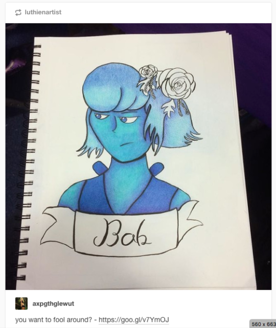
[Screenshot of my drawing of Lapis Lazuli. My original description was replaced with the text “you want to fool around?” and a link that leads to God knows where.]
It’s happened. Again. For some bizarre reason a p/orn bot is using your completely safe for work art to get click throughs to something that’s definetly not safe for work.
You desperately want at least your attribution back, but since Tumblr is so horrifically set up you’re very sure there’s no way to do that.
Except you can!
Tumblr allows you to report copyright violations which includes removing your description and injecting their own link. But how to do this?
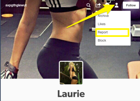
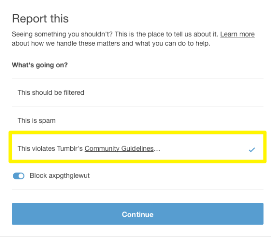
Step 1: Report them
Go to that human icon, click it to go to the drop down, and select “Report”.
Step 2: Select “Community Violation”
This behavior is explicitly against the Tumblr terms of service so that’s where it goes.
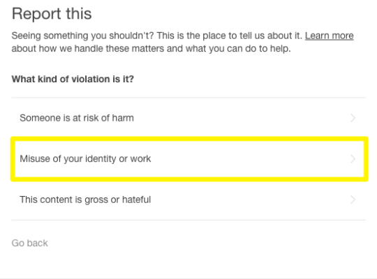
Step 3: Select “Misuse of your identity or work”
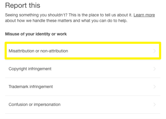
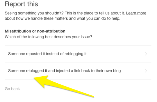
Step 4: Select “Misattribution or non-attribution”
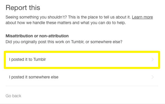
Step 5: Select “yes”, this is your work that’s being misattributed.
Step 6: Select “yes”, you posted it to Tumblr.
Step 7: Select “Someone reblogged it and injected a link to their own blog.”
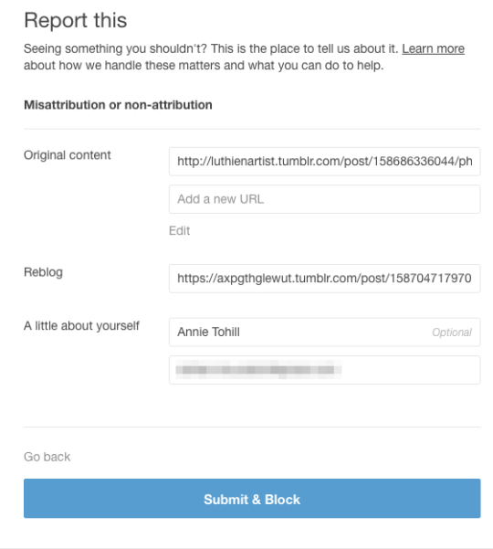
Step 8: Put in the link to your original post, the link to their reblog, and your email. Then submit!
You can get it the link to the reblog without going to their blog directly by going to the dash view of the blog, hovering over the top right corner, right clicking and selecting “copy link address.
While all of us here on this trash website enjoy picking on staff, in my experience they take care of this kind of thing relatively quickly (usually 2-3 days).
I hope this has helped at least some of you, and remember: only you can stop bot reblogs. [insert gif of Smokey the Bear here]
Thank you so much these kind of links are smothered all over my art posts and I didn’t think there was anything I could do about it
i did not know about this functionality. Here have a useful thing, friends!